The beveled button and the drop shadow have packed their bags. What was once a sign of digital sophistication now just makes a product page feel like a museum display case—distant, glossy, and slightly dated. That layered, skeuomorphic aesthetic creates visual noise that competes with your products, leaving a clean brand message looking cluttered and unsure of itself.
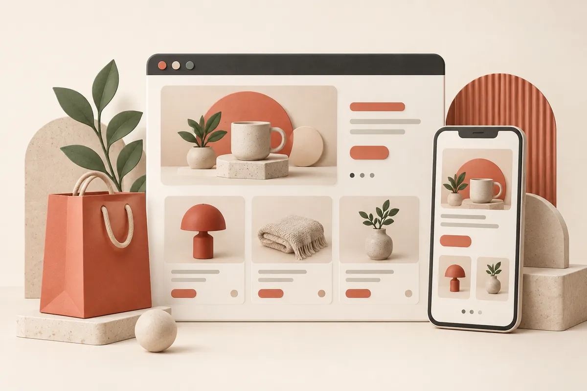
This shift demands themes built on clarity and space, where typography and imagery do the heavy lifting. We’re looking at flat, content-first designs like Fashionopolism’s sharp layouts or the minimalist confidence of Startup, where the focus is ruthlessly returned to what you’re selling. The right theme doesn't just look modern; it constructs a seamless path from browse to cart. See which frameworks turn that philosophy into a functioning store.
Product list
Resources in this article
Compare the options below. Check the provider’s current features, pricing and compatibility before choosing.