A customer adds a size medium to their cart, then hesitates. They scroll back up, squint at the product description, and finally abandon the page. That moment of uncertainty—not about the product, but about the fit—is where sales silently vanish. It’s a conversion killer that no amount of beautiful photography can solve, leaving you with returns, support tickets, and a nagging sense that your sizing information is failing to do its job.
This post digs into Shopify apps built specifically to end that confusion. We’ll look at tools like Ultimate Size Chart and Kiwi Size Chart & Recommender, which transform vague sizing into clear, interactive guides. The right app doesn’t just display measurements; it builds customer confidence and closes the sale. See which one can turn your size chart from an afterthought into an asset.
Product list
Resources in this article
Compare the options below. Check the provider’s current features, pricing and compatibility before choosing.
Kiwi Size Chart & Recommender
shopifyThis Shopify app makes it easy for you to create multiple size charts for your online store, enabling your customers to find their perfect fir. Kiwi Size Chart & Recommender comes with flexible size chart layouts, so you can add multiple tables, tabs, images, and videos, and it will automatically detect a customer's location and present measurements in the appropriate units for their country.
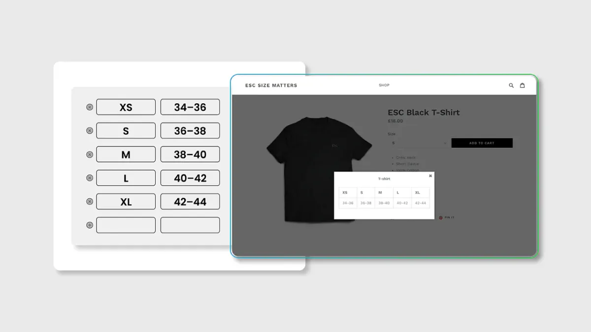
ESC Size Charts
shopifySize Matters is a user-friendly way for you to create size guides for your products with the help of a table generator. Plus, this Shopify plugin comes with support for unlimited size guides, it enables you to easily customize the appearance of your size charts using CSS, and it allows you to add size guides to product pages using a single line of code.
BF Size Charts & Size Guides
shopifyThis Shopify app enables you to create size charts for a wide range of items, including shirts, shoes, hats, rings, bracelets, bras, necklaces, and more. Best Fit - Size Charts also offers support for unlimited size guides, and it features a responsive design, making it compatible with mobile devices like tablets and smartphones.